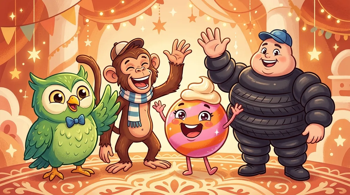
Brand mascot design strategy: why Duolingo's owl works
Mascots are back - and they're driving real numbers. Here's the psychology behind why they work, the archetypes that actually fit different brands, and how to build one of your own.
On February 11, 2025, Duolingo posted that Duo the Owl had died.
Cause of death: a Tesla. The announcement was deadpan. The brand wore black. Social media lost its mind - mentions spiked by roughly 25,000% overnight, the initial Instagram post got two million likes, and the resurrection campaign that followed became one of the more discussed marketing moments of the year.
None of it was an accident. It was the result of a deliberate, years-long strategy built around a single character. The numbers are harder to dismiss than most people expect.
Why mascots are having a moment again
For a while, mascots felt dated. The Kool-Aid Man, the Geico Gecko, the Pillsbury Doughboy - these were artifacts of TV advertising, of a time when brands needed to stand out on thirty-second spots. Then digital marketing arrived and everybody went clean. Minimalist logos. Brand systems. Sans-serif everything. Mascots became unfashionable.
Then social media changed the calculus.
When your brand needs to post content every single day - TikTok, Instagram, X, YouTube Shorts - a mascot is not a liability. It is infrastructure. A character can react to news, wear a Halloween costume, fight with a competitor, mourn a celebrity, flirt with another brand's mascot. A wordmark cannot do any of that.
54%
Of the world's most admired companies use mascots in their marketing
Fortune / Dream Farm Studios survey
74K+
Mascots in active commercial use globally in 2024
Market Reports World, 2024
29%
Increase in demand for mascots used in viral marketing campaigns
Market Reports World, 2024
3.5x
Duolingo's mascot TikTok engagement vs. competitor average
Rival IQ, 2024
74,000 commercial mascots are in active use globally. Demand for digital-native mascots is up 29% year over year. This isn't nostalgia - it's a response to a practical problem: content-heavy channels need something that can show up in new contexts every single day.
The psychology behind why mascots work
Before you design anything, it helps to know why mascots actually work. Not "they're cute" or "they're memorable" - the real reason is more specific.
When you assign human traits to a brand character - facial expressions, a personality, emotions a person might recognize - brains process that character roughly the same way they process another person. Trust and familiarity kick in. A 2023 paper in Advances in Decision Sciences found that anthropomorphic mascots directly improve purchase intention through brand image, perceived value, and emotional engagement. The effect isn't subtle.
There's also a compounding dynamic that advertising spend doesn't replicate. The Michelin Man has been around since 1898. 90% of people worldwide recognize him on sight. That kind of recall builds through repetition - each appearance adds a small deposit to the same emotional account. You can't manufacture it in a quarter.
Shape language matters here too. Rounded forms signal warmth. Dynamic postures signal competence. The best mascots carry both, sometimes in the same face. Duo the Owl has large, round eyes - approachable, almost childlike - but his expression ranges from enthusiastically helpful to quietly threatening. That ambiguity is a lot of what makes him interesting to watch. A straightforwardly friendly mascot would be forgettable.
Duolingo as a masterclass
Duolingo is worth studying because they built a mascot strategy from scratch in the social media era and published enough data to actually learn from.
When CMO Manu Orssaud joined from Spotify in 2020, Duolingo dropped traditional TV campaigns almost entirely. The social media team was given real freedom to respond to trends without approval chains. Duo developed a personality - obsessive, passive-aggressive, occasionally menacing - that mirrored what the product actually does. Duolingo sends you daily reminders. That IS the product.
By 2024:
- 10 million new TikTok followers in a single year
- 116 million monthly active users
- $192.6 million in quarterly billings
- Cost per acquisition 30% below industry average
The takeaway isn't "make your mascot weird." It's that Duo's personality can't be separated from the product mechanic. The character isn't decorating the product - it's expressing it. A daily-reminder app embodied as an owl who won't leave you alone. That alignment is why the strategy works, not the meme format.
Tip
Before designing your mascot, write one sentence that describes your brand's core behavior or promise. Your mascot's personality should make that sentence visible without words.
Four mascot archetypes
Most mascots fall into one of four categories. Each has different strengths, different risks, and different fits depending on what your brand does.
| Archetype | Examples | Best for | Risk |
|---|---|---|---|
| Animal | Duolingo Owl, Geico Gecko, Mailchimp Chimp, Linux Tux | Brands that want flexibility - animals carry natural personality associations | Can feel generic if not given a specific, differentiated personality |
| Human character | Wendy's Wendy, KFC Colonel Sanders, Mr. Monopoly | Brands built on a founder story or personal value system | Difficult to rebrand; aging can become awkward |
| Product as mascot | M&M's Spokescandies, Pillsbury Doughboy, Duracell Bunny | Product-centric brands where the item itself IS the story | Works best when the product has inherent personality; hard to force |
| Abstract/minimal | Reddit's Snoo, Android Bugdroid, Mozilla Firefox fox | Tech brands and communities that need adaptability across contexts | Requires strong community or long-term consistency to build meaning |
Choose the archetype that maps to your brand's core identity, not the one that looks most appealing in isolation.
The animal archetype is the most flexible - animals carry pre-existing associations that do some of the work for you (owls = wisdom, obsessiveness; geckos = quick and charming; chimps = playful and approachable). The product-as-mascot archetype is the hardest to pull off but the most powerful when it works - the Duracell Bunny IS the battery test, not a mascot who talks about batteries. The abstract archetype is underrated. Snoo and Bugdroid are minimal enough to be endlessly remixed, which means they survive redesigns and community adoption in a way human or animal mascots usually don't.
Mascot examples worth studying
These are brands that got mascot design right - and for very different reasons.
Duo the Owl
EdTech (Duolingo)
The definitive modern mascot. Passive-aggressive, obsessive, occasionally threatening - a perfect mirror of an app that reminds you every day. The personality is the product premise, not an addition to it. Duolingo's TikTok engagement rate runs 3.5x above competitor average because of him.
Michelin Man (Bibendum)
Automotive (Michelin)
Born in 1898 from a pile of tires that looked like a human body. Has been in continuous use for 125 years. 90% global recognition. The mascot humanizes an industrial product - you trust a friendly, tire-bodied guide with your road safety in a way you don't trust a logo.
Freddie the Chimp
SaaS (Mailchimp)
The company was literally named after the mascot. In a category full of serious enterprise tools, Freddie made Mailchimp feel approachable for non-technical small business owners. The company sold for $12 billion. Freddie was there from day one.
Geico Gecko
Insurance
Started as a joke - people kept mispronouncing Geico as gecko. The creative team leaned into the confusion and built a character around it. The gecko became one of the most recognized mascots in American advertising history. Turning a brand weakness into a mascot is genuinely brilliant.
M&M's Spokescandies
Confectionery (Mars)
Launched in 1954. The genius: different mascots for different colors, each with its own personality. Red is sarcastic, Yellow is goofy, Green is confident. This gives the brand infinite story threads across campaigns. An M&M's ad compilation on YouTube has over 43 million views.
Wendy
Fast food (Wendy's)
Dave Thomas named the restaurant after his daughter. The pigtailed girl on the logo is a literal family story made visual. Wendy's Twitter account later became famous for its sharp-tongued personality - same character, adapted for a new medium, sixty years later.
Duracell Bunny
Batteries
The bunny keeps going when others stop. That is the entire product promise, demonstrated visually, running since 1973. You do not need to explain it. The mascot IS the demonstration. Fifty years of consistent brand recognition built on one clear visual metaphor.
Reddit's Snoo
Social media (Reddit)
Started as a doodle in co-founder Steve Huffman's notebook. Now it's a platform symbol that every subreddit customizes with its own theme. The genius is that Snoo is minimal enough to be remixed infinitely - so the community ends up owning the character as much as the company does. That's hard to engineer deliberately; Reddit basically got lucky that the design was simple enough to survive it.
Design principles that actually matter
Most mascot design guides tell you to "be original" and "match your brand values." That's not advice - it's a restatement of the goal. Here's what actually moves things.
Your mascot needs a point of view. Duo has opinions. The Geico Gecko has opinions. M&M's Red has opinions. A mascot without a point of view is clip art with a face. The personality doesn't need to be extreme - it needs to be specific. "Friendly and helpful" is not a personality. "Friendly but will absolutely judge you if you skip your lesson" is a personality.
The best mascots express the product promise without having to narrate it. The Duracell Bunny keeps going when others stop. You understand the product claim before anyone speaks. When your mascot can do that, every piece of content is also a product demonstration - which is a much better deal than content that just entertains.
Build for constraint before you finalize anything. Mascots end up in weird places - billboard, favicon, TikTok video, Halloween costume. Excessive detail breaks down under compression. The Android Bugdroid is three circles and a rounded rectangle. It works everywhere. If your mascot only looks good at full size on white, you have a problem.
Commit, and don't pretend you can walk it back easily. People treat mascots like campaigns - something you run for a while and then replace. The Doughboy launched in 1965. Sixty years of poking the same belly button. That repetition is the asset. Rebranding a mascot throws away equity that genuinely cannot be rebuilt.
Warning
Mascots require long-term commitment. If you change your mascot every few years, you lose all the compound equity you've built. Redesigns should evolve the character, not replace them.
Building your mascot with AI tools
The economics of mascot creation have shifted.
A few years ago, building a brand mascot meant hiring a studio, multiple rounds of concepting, and somewhere between $5,000 and $50,000 depending on complexity. That pricing structure meant mascots were mostly a large-brand thing. Smaller companies got the same advice and just couldn't follow it.
AI character generation tools have changed the exploration phase meaningfully. You can generate dozens of directions in an afternoon, test different personalities and visual styles, and pressure-test concepts before any money changes hands. The quality ceiling is still below what a dedicated studio delivers - but the floor has moved up enough that the gap is actually manageable.
The workflow that tends to work: use AI for concept exploration, then bring your strongest direction to a human illustrator for production execution. You show up to that conversation with a clear brief and a tested direction rather than a vague idea. The illustrator spends time building, not searching for a concept you should have found yourself. That's a different kind of engagement.
What AI doesn't do is give the character a personality. That's still your job. Before generating anything, you need to know what your brand actually does, who it's for, and what emotional work the mascot is supposed to perform. A character without that foundation is just a drawing that looks like other drawings.
Illustrative model based on mascot effectiveness research. AI-assisted approaches close most of the quality gap at a fraction of the cost.
The questions to answer before you start
Work through these before touching any design tool.
What does your brand actually do - not what your about page says, but what the core mechanic is? Duolingo sends daily reminders. That behavior became a character.
Who are you trying to reach, and what do they need to feel about you? Mailchimp needed small business owners to feel like email was manageable. A chimp named Freddie does that better than a corporate logo would have.
What's the one word that describes your mascot's personality? Just one. Start there. Duo is persistent. The Gecko is charming. The Doughboy is wholesome. Everything else follows from that word - the posture, the expression, the color palette, what the character does and doesn't do.
Which archetype fits? Solo founder with a personal story - probably a human character. Building a community platform - probably abstract and minimal. Product with an inherent personality - build from the product itself.
Write the answers down before generating anything. The character is the strategy made visible. If the strategy is wrong, illustration won't fix it.
References and sources
- Adweek: The Marketing Strategy Behind Duolingo's Duo - Duolingo's shift from TV to social-first, mascot strategy overview
- Brand24: Duolingo Social Media Strategy Report 2026 - engagement rate data, follower growth
- Rival IQ: Duolingo TikTok Marketing Strategy - 21.5% engagement rate, 3.5x competitor comparison
- Meltwater: Duo Is Dead - Campaign Data - 25,560% mention spike data
- Market Reports World: Mascot Market Size and Trends - $5.12B market data, 74K mascots in use
- Dream Farm Studios: How to Create a Brand Mascot - Fortune 54% statistic, mascot psychology overview
- Advances in Decision Sciences: Brand Mascots and Consumer Purchase Intentions - anthropomorphism and purchase intention research
Create Your Own Character
Bring your character to life - generate a portrait, personality, and backstory with AI.
Create Character - Free